What's driving the Mini's audio system?

Two colleagues of mine (Naseem Hasan and Jared Jeffers) and I recently conducted an evaluation of the Mini Clubman's dashboard user interface. A good portion of the 'eval' focused on the Mini's powerful and feature-rich audio system.

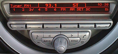
Most of the controls for the audio system and the car's computerized settings are situated near the oversized analog speedometer. Although most controls are well-labeled (including 'Audio' for switching modes and 'Main Menu' for navigation), the system suffers from an inefficient layout of controls and poor error recovery.

The main selection dial for the audio system is located just below the FM tuner buttons and could be easily mistaken for the separate volume control, which sits below the CD player outside of the main area of interaction. This volume control seems disconnected from the rest of the audio system.

The system has direct iPod and iPhone connectivity providing users versatility and flexibility with inputs for both auxiliary and USB cables that can double as device chargers. However, when we tried using the iPhone in both AUX and USB modes, a message read "This accessory [cable] is not made to work with the iPhone". The Mini's user manual says that the cable is only made to work with some iPhone models, but it does not say which ones it works with or where to find out which models it does work with. It is important for users to be able to recover from errors and build trust in the systems that they use.

You can read the full article here.

Comments

Popular posts from this blog

Setting a price alert on Stubhub

A few weeks ago, my wife and I really wanted to see Alvvays and Frankie Rose at Metro in Chicago. But the show sold out and I was left to look for tickets second-hand. I've used Stubhub before to purchase concert tickets but up until now, hadn't tried their Price Alert feature which lets you set a ticket price max and be notified when the price goes below it. The user experience from beginning to end was really good. The feature is easy to find and provides very mobile-friendly controls to create the alert. The Price Alert tab was prominent on the event details screen - very easy to find. Note: today (1/5/18), Stubhub has removed those tabs and you have to tap an Info button top right of the viewport to look for the same feature. It's a still a good UX once you get there but it's an additional step. The Price Alert feature is intuitive and uses tappable numbers to let me pick the quantity of tickets (not a clunky dropdown menu or less efficient plus/minus p

A site map for a music application

For the past several months, I've been working with the CHIRP Radio volunteer tech team to design a mobile solution that allows station DJs to plan out their weekly shows. At a high level, a DJ should be able to browse and select songs from a massive music library, and add them to one or more playlists, which can be used for their shows. The app also has functionality like the ability to read album reviews, view recent activity by DJs in the app, and review a DJ's profile. A site map is an important artifact when designing any application or website. It shows how the overall navigation should be structured, can be used with end users to validate the taxonomy, and is helpful for developers as a companion to wireframes or mockups. Below is a site map I recently created for the project. The highest level navigation options are lighter in color, while as the user navigates deeper, darker colors are used to represent those options. The coloring isn't necessarily a known

KEXP's new Apple TV experience

I love KEXP . It’s a listener-supported radio station in Seattle. It streams all around the world on its website and mobile app. And they’ve had a really good app for the Apple TV for some time - great to stream in the house at a high volume!  And I’ve reviewed them before here . Oh, and also here .  They recently released an excellent new version of the app for Apple TV. And although it doesn’t introduce a lot of new features, it’s way more visually engaging and maximizes the screen real estate much better than before. Here are some of the major changes... Additional, prominent functionality- Archive (stream any show from the past) and streaming Settings The old version had a lot of wasted, unused screen real estate while the new version makes more efficient use of the screen New, large, colorful tiles along the bottom represent each song played in chronological order You can scroll left and right to see history of songs played (much further back in history than before) Larger album