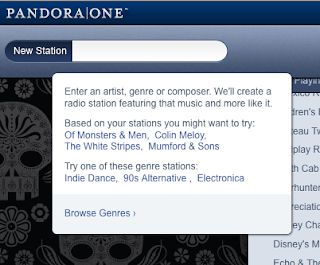
Pandora, Rdio highlight features to help new users

Creating a new station on Pandora is not complicated at all.  You type in an artist, song, genre, etc. and the search field starts to predict what you want based on the letters you type - this is called auto-complete, not new but very useful and quickly becoming part of users' mental model, it's what they expect when they search.  After you find what you want (e.g. Shoegaze, Mickey Mouse), the station populates your list of current stations on the screen and a song start playing right away. The process is very intuitive and few steps are required for the user to start a new station. 


But the most useful part about creating a station is how Pandora explains the feature when you click into the search field.  This is called feature highlighting, a contextual way to explain how to use certain areas of the product. When you click in the search field, you understand the value of the feature. 

Rdio (left) has an even more elaborate way to do this called a Feature Tour (highlighting various parts of the UI upon first use). Although users can read and close these highlighted features, they have a way to open them again (under the Settings or Help menu).

All web applications, even those outside of the music space, should take advantage of this quick, low-cost, unobtrusive way to promote the value of new or existing features. 

Comments

Popular posts from this blog

Setting a price alert on Stubhub

A few weeks ago, my wife and I really wanted to see Alvvays and Frankie Rose at Metro in Chicago. But the show sold out and I was left to look for tickets second-hand. I've used Stubhub before to purchase concert tickets but up until now, hadn't tried their Price Alert feature which lets you set a ticket price max and be notified when the price goes below it. The user experience from beginning to end was really good. The feature is easy to find and provides very mobile-friendly controls to create the alert. The Price Alert tab was prominent on the event details screen - very easy to find. Note: today (1/5/18), Stubhub has removed those tabs and you have to tap an Info button top right of the viewport to look for the same feature. It's a still a good UX once you get there but it's an additional step. The Price Alert feature is intuitive and uses tappable numbers to let me pick the quantity of tickets (not a clunky dropdown menu or less efficient plus/minus p

Redesigning the MySpace music player

Originally a major competitor to Facebook, MySpace has evolved from a being a place for 'friendships' to an important site in digital music. Like Facebook, artists can create profile pages for fans to follow but artists can also embed songs into a music player for fans to listen to. This functionality has really opened the door for discovering new music (especially for new artists who don't have a label or a means of distribution and marketing). However, MySpace's music player (above) suffers from some usability issues including small controls and an inefficient screen layout . When advancing through a song, users have to move a very small slider control that requires unnecessary precision . An improved, larger control would be much easier to click and drag than the current small rectangle shape. Also, the two-row layout of songs in the artist's queue is inefficiently designed . A maximum of only five songs can be listed in the queue at one time and then user

A site map for a music application

For the past several months, I've been working with the CHIRP Radio volunteer tech team to design a mobile solution that allows station DJs to plan out their weekly shows. At a high level, a DJ should be able to browse and select songs from a massive music library, and add them to one or more playlists, which can be used for their shows. The app also has functionality like the ability to read album reviews, view recent activity by DJs in the app, and review a DJ's profile. A site map is an important artifact when designing any application or website. It shows how the overall navigation should be structured, can be used with end users to validate the taxonomy, and is helpful for developers as a companion to wireframes or mockups. Below is a site map I recently created for the project. The highest level navigation options are lighter in color, while as the user navigates deeper, darker colors are used to represent those options. The coloring isn't necessarily a known